 Synergy
Schedule a call
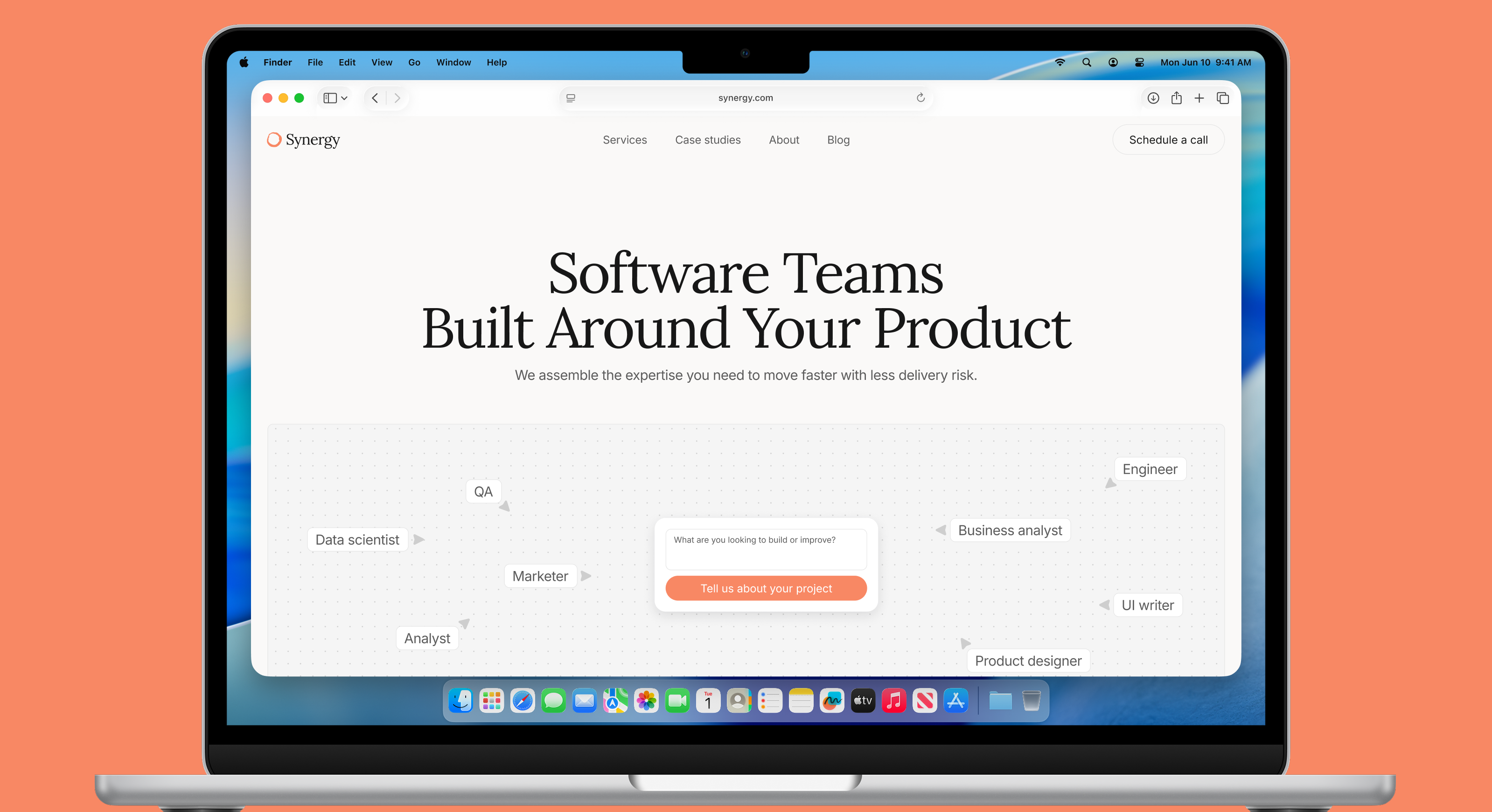
Research
Competitive and category research
I analyzed leading software development and similar service companies, with particular attention to how mature players communicate credibility, structure proof, and position their primary CTA.
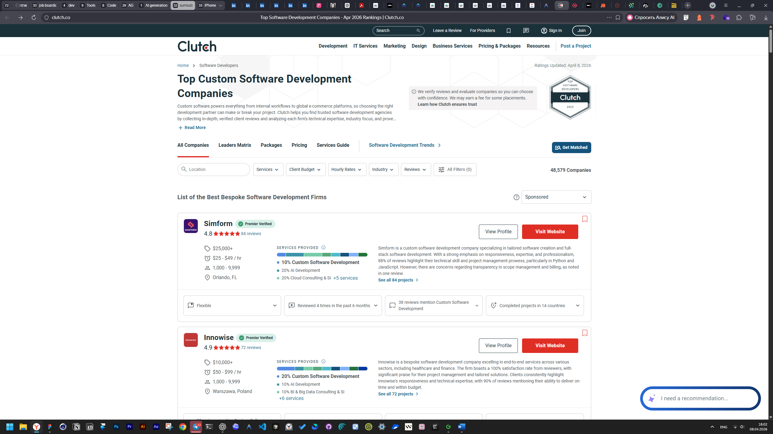
Pattern benchmarking
I mapped effective and ineffective patterns across information architecture, visual hierarchy, proof placement, typography, and CTA behavior.
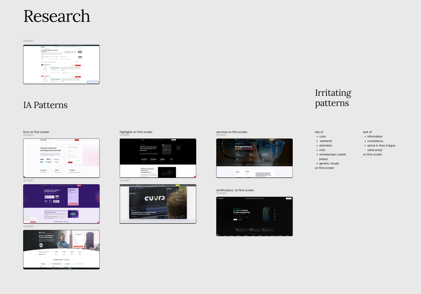
Visual research
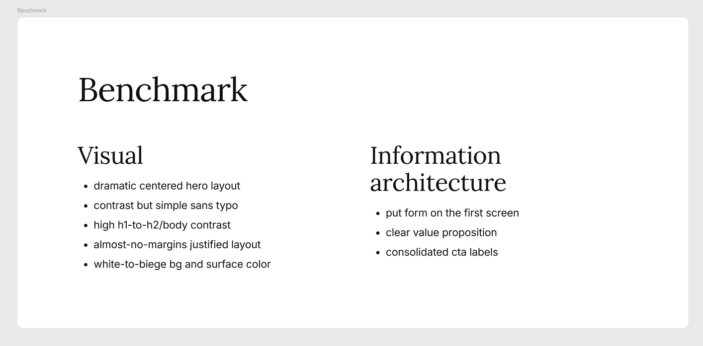
I gathered references for different layers such as: layout, typography, color, images, ui elements, positioning and value prop and also described benchmarks for design and information architecture.
Design
Header

The original header felt crowded and distracting, with too many low-priority elements competing with the main action.

I simplified the header by removing non-essential items, moving the language selector and Contact to the footer, and refining the logo and button hierarchy. Schedule a call as the main accent CTA in the hero, becomes accent on scroll and remain silent when hero section is in viewport.
Success metric: click-through rate on the header Schedule a call button after scroll.
Hero section

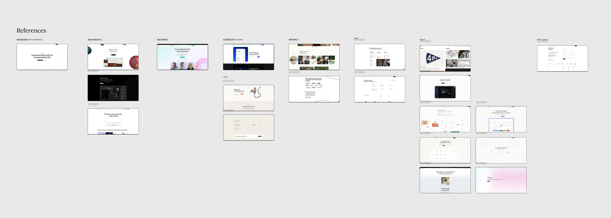
The original hero relied on generic service-company messaging and a more decorative visual center, which made the offer feel less mature and did not clearly connect the team structure to a concrete product context.
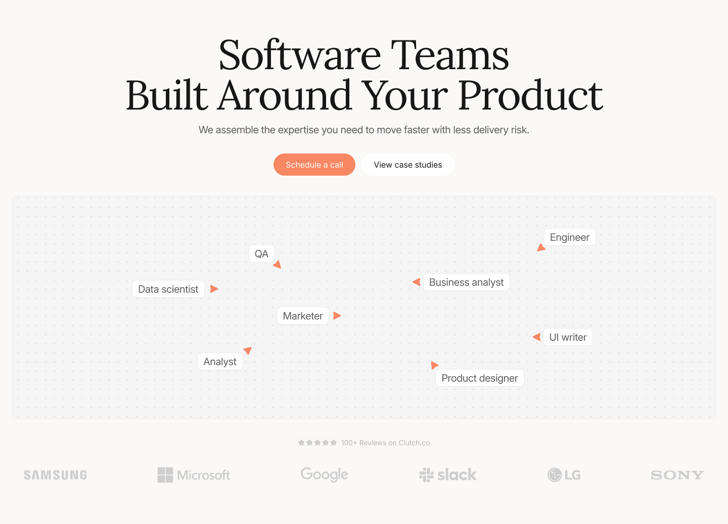
I rebuilt the hero around a shared working board, with cross-functional roles aligned around one collaborative surface. Metaphor become more grounded with the clients logo section beneath, which is more credible for a B2B audience.
Success metric: hero CTA click-through rate on Schedule a call.
Trade-offs: I chose not to place a form in the hero, despite the benchmark, because the stronger trade-off was between early capture and a more confident first impression.
Instead of asking for user data before communicating value, I made the hero more product-led and trust-building. Still, I’d validate this with an A/B test against a version with the form, using direct form submissions as the key metric.
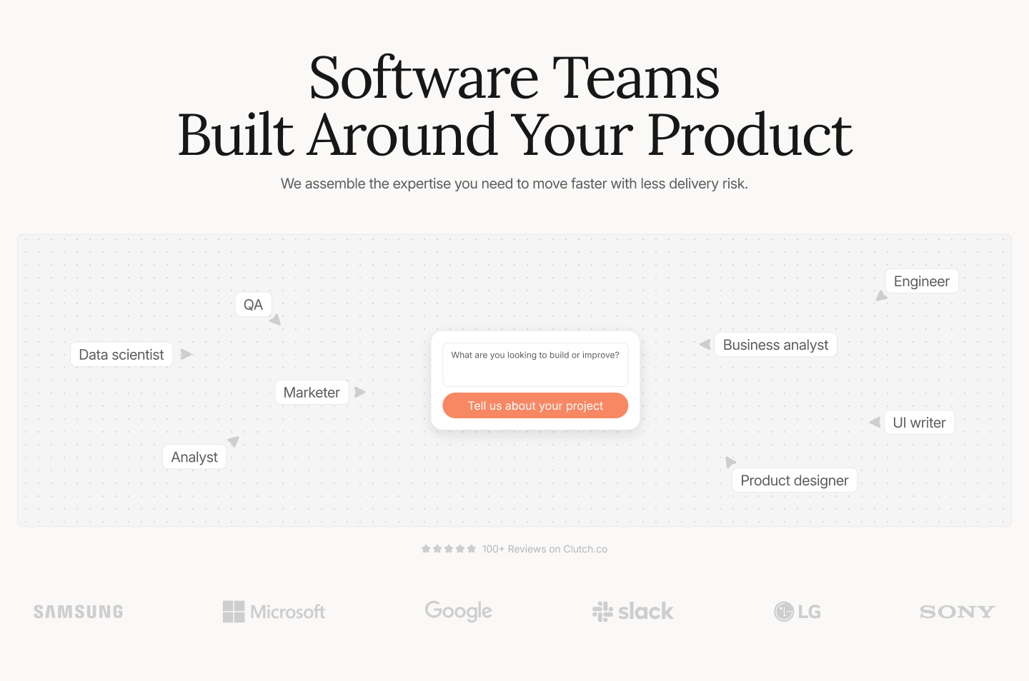
Then I came up with the Idea to introduce a small project brief on the first screen and it turned hero into a more meaningful and service-relevant metaphor. It shows the team aligned around a concrete client input, which makes the experience more conversion-focused.
Trust section
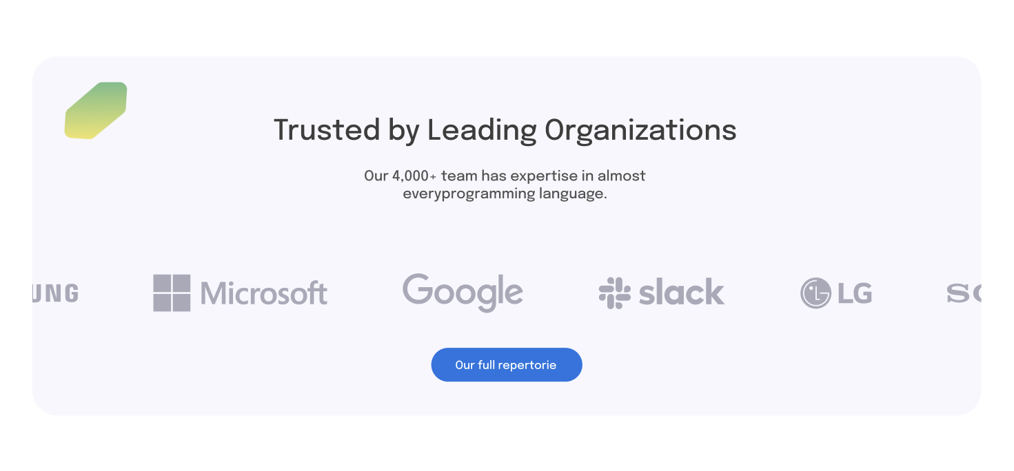
The original trust block depended mostly on logos, which signaled recognition but offered limited evidence of outcomes or partnership quality.
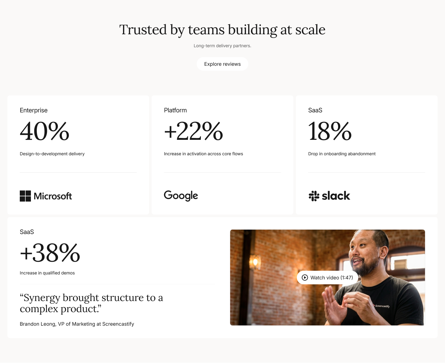
I redesigned it as a proof system that combines brand recognition, metric-led proof cards, and one featured client story with a human face and video CTA. This makes the company feel more established and trustworthy.
Success metric: Contact-form start rate among users who viewed this section.
Trade-offs: I tried different layouts, highlights cards only and big video card, but decided to combine it and use more module-grid based layout keeping video content inline within cards flow.
Contact section
There was no actual contact form, may be it was opened as a popup when clicking cta button but still, having is as a separate section is crucial for affordance, CEO-optimization and discoverability.
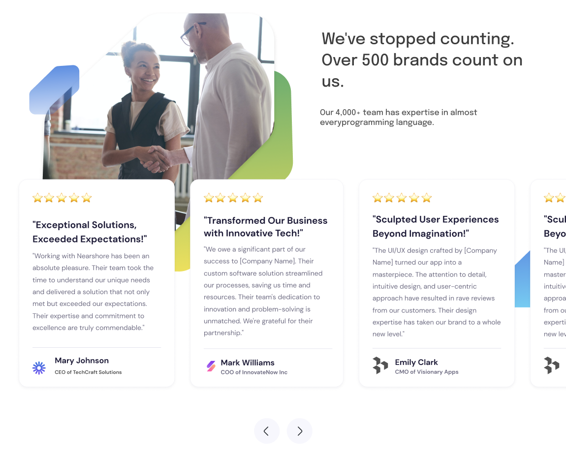
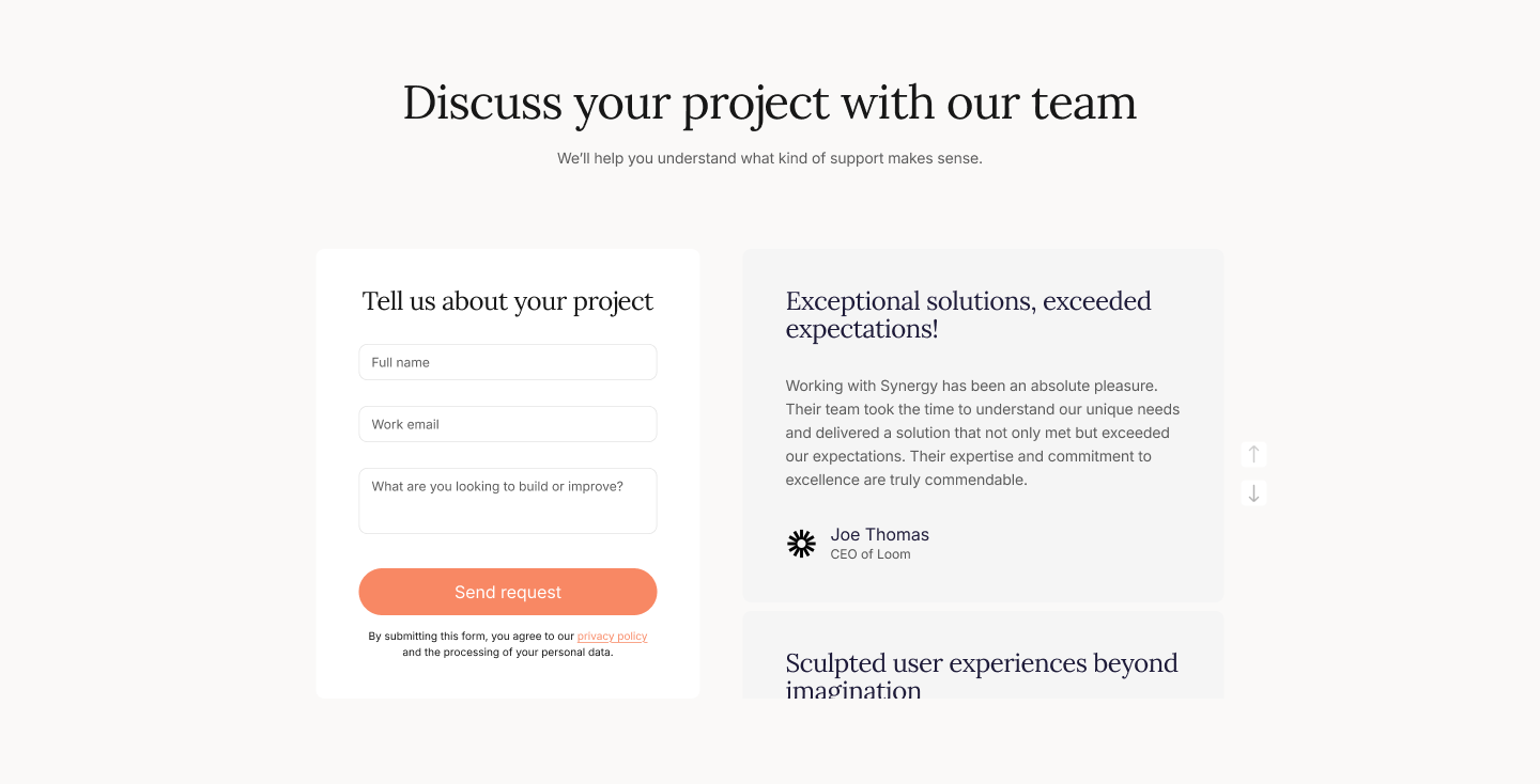
I redesigned reviews and combined them with the contact form which I placed after stronger trust section and services so the move to main CTA feels more natural and informed. I places reviews slider next to form to support decision of contact.
Success metric: form submission rate for qualified contact requests.
Trade-offs: I guess we should put main focus on testing this section, I still wonder what if we put it earlier on the page or it’s not actually matter.